Healing Warrior, LLC
LOGO DESIGN/BRANDING and PRINT DESIGN
Photoshop & Illustrator
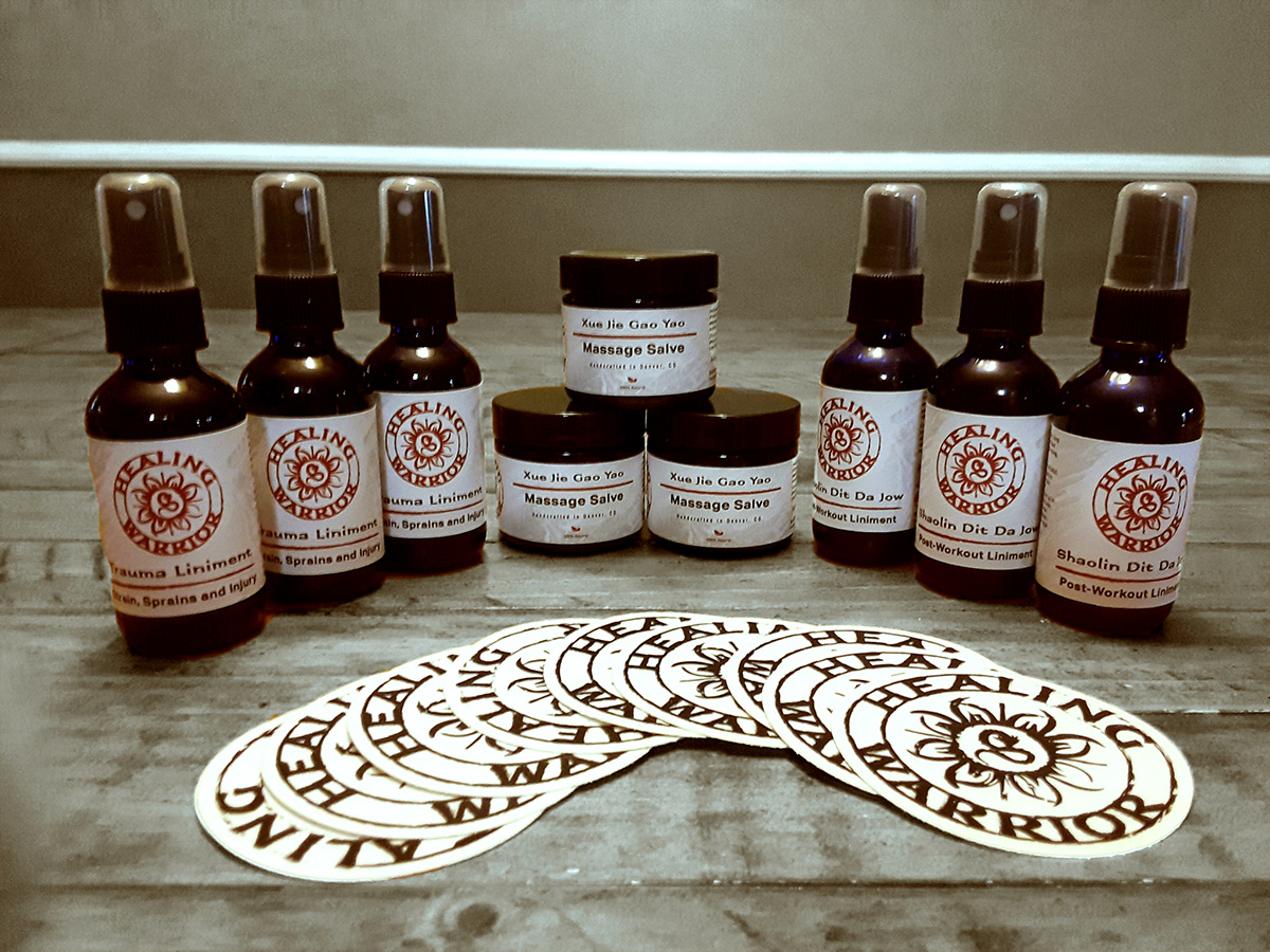
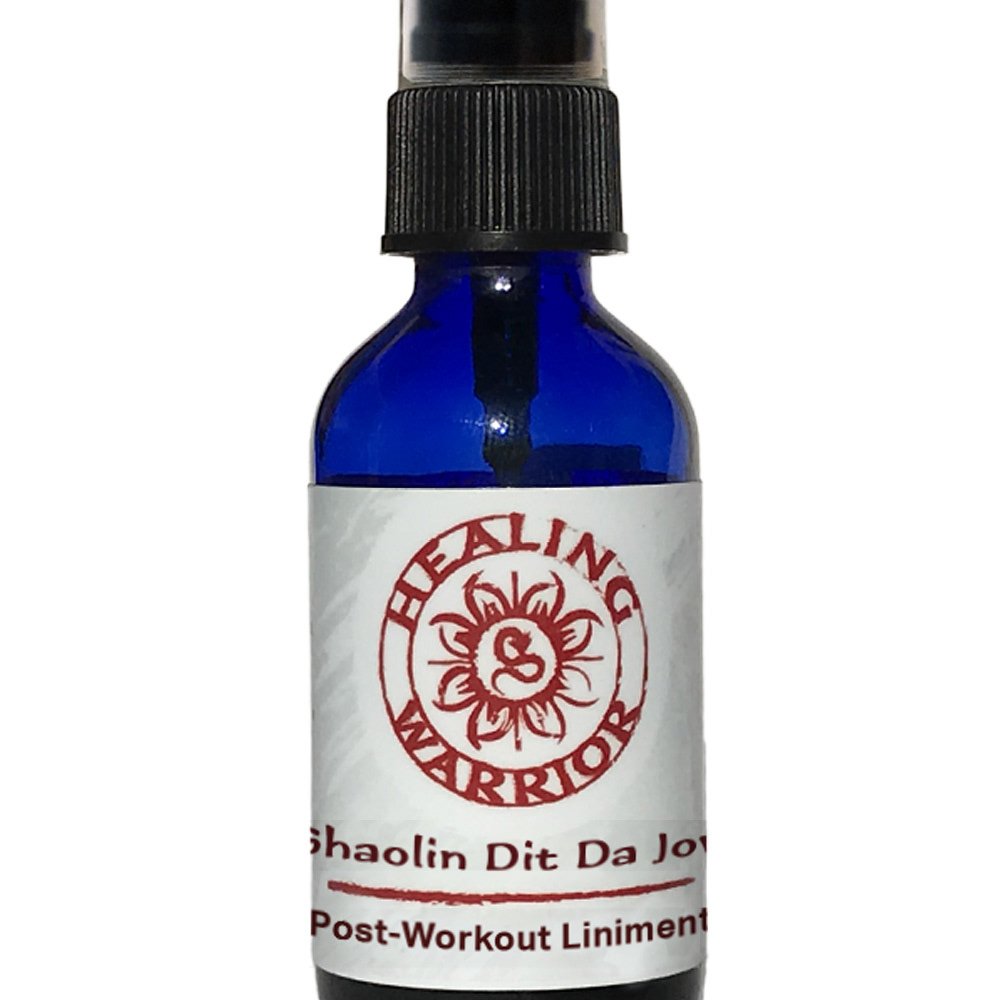
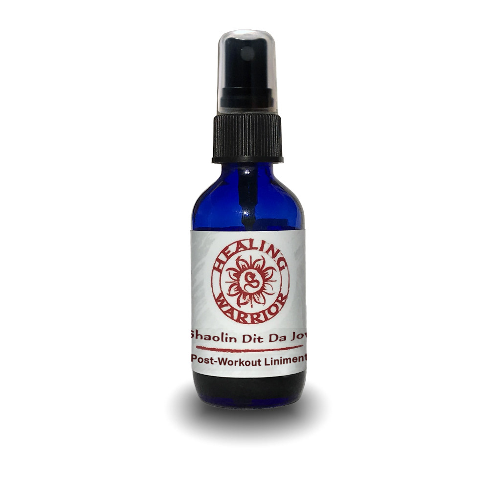
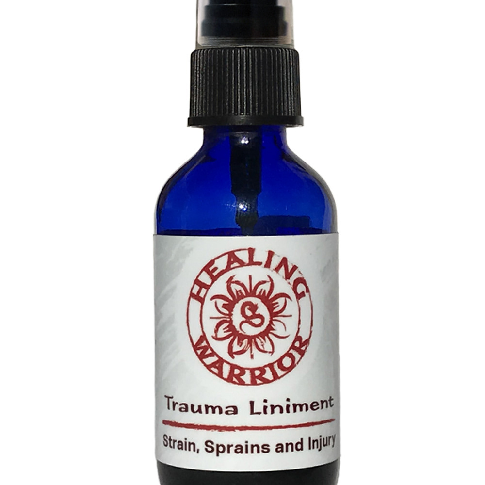
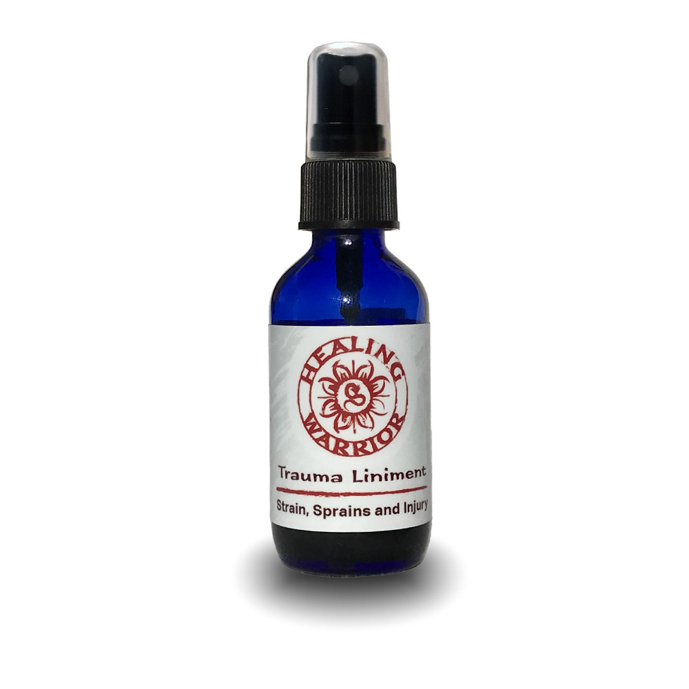
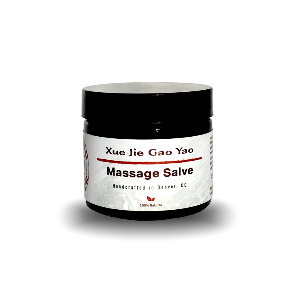
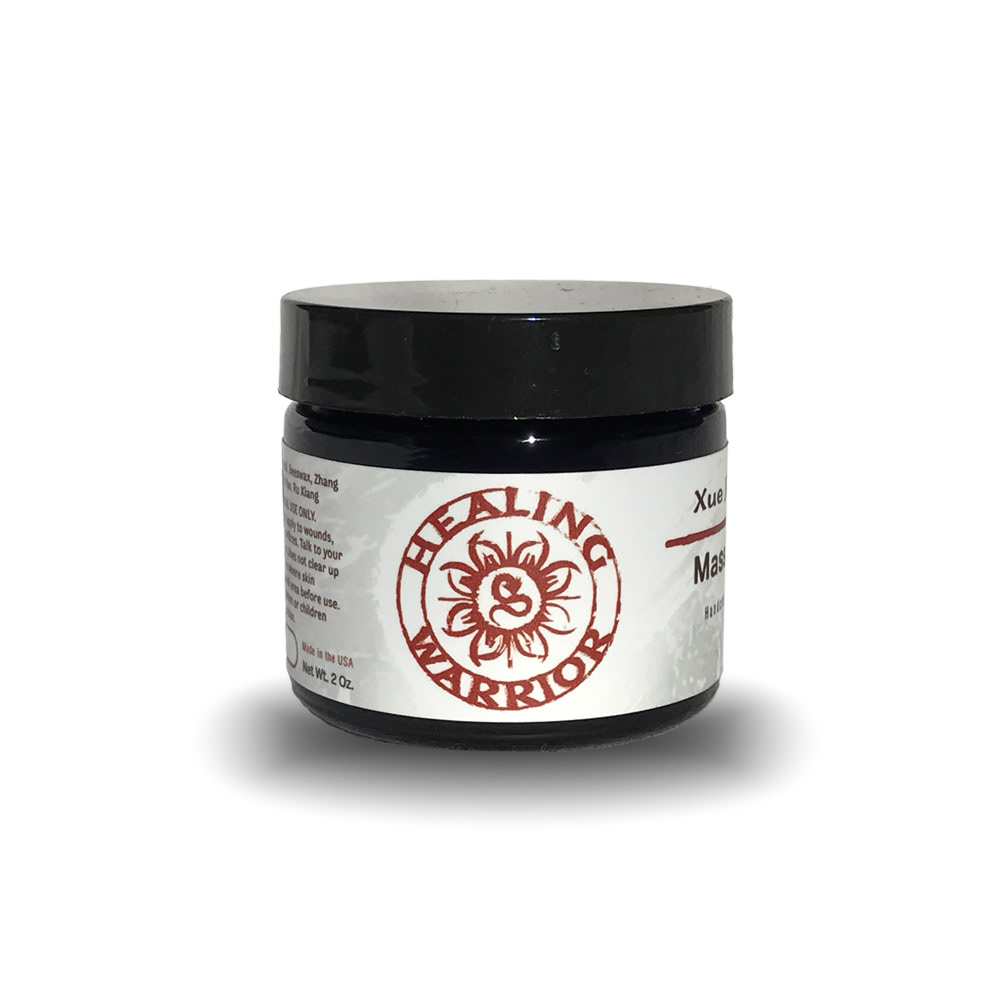
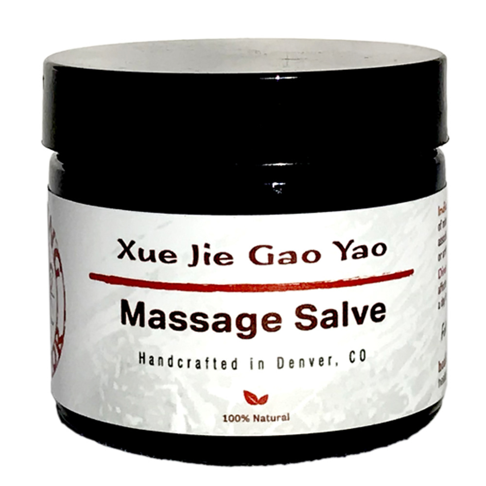
Healing Warrior is all about herbal remedies for the modern warrior. They market to the MMA crowd and are committed to providing non-chemical alternatives for relief to common ailments. This contract included logo design and print design of the initial product line-up at launch. The challenges were to see where we could take the design, but as you can see here, a strong eastern design was used in the final imagery to convey the origins of the formulas and their ingredients.

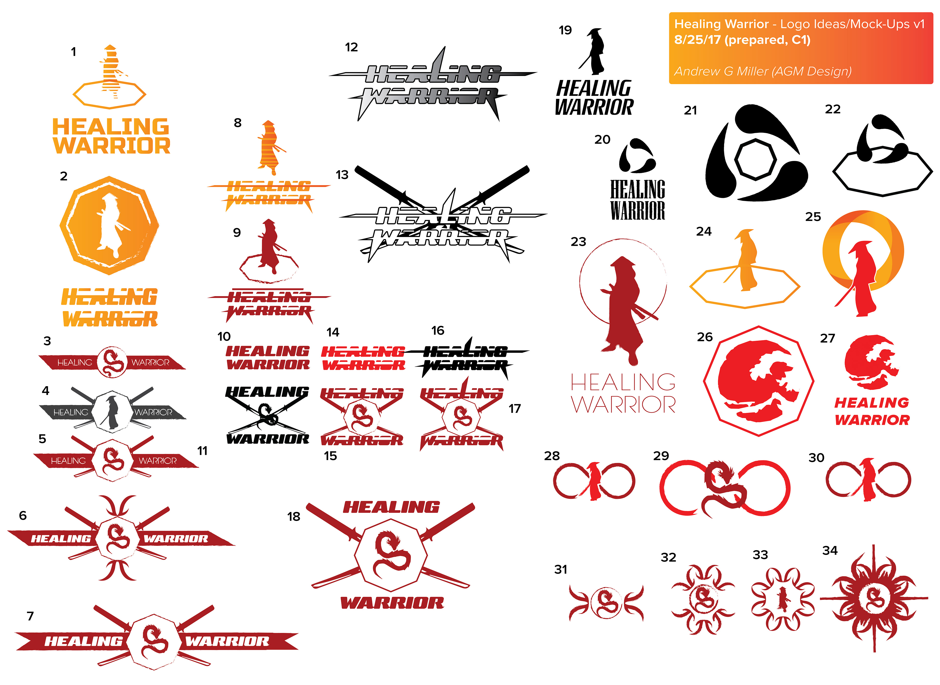
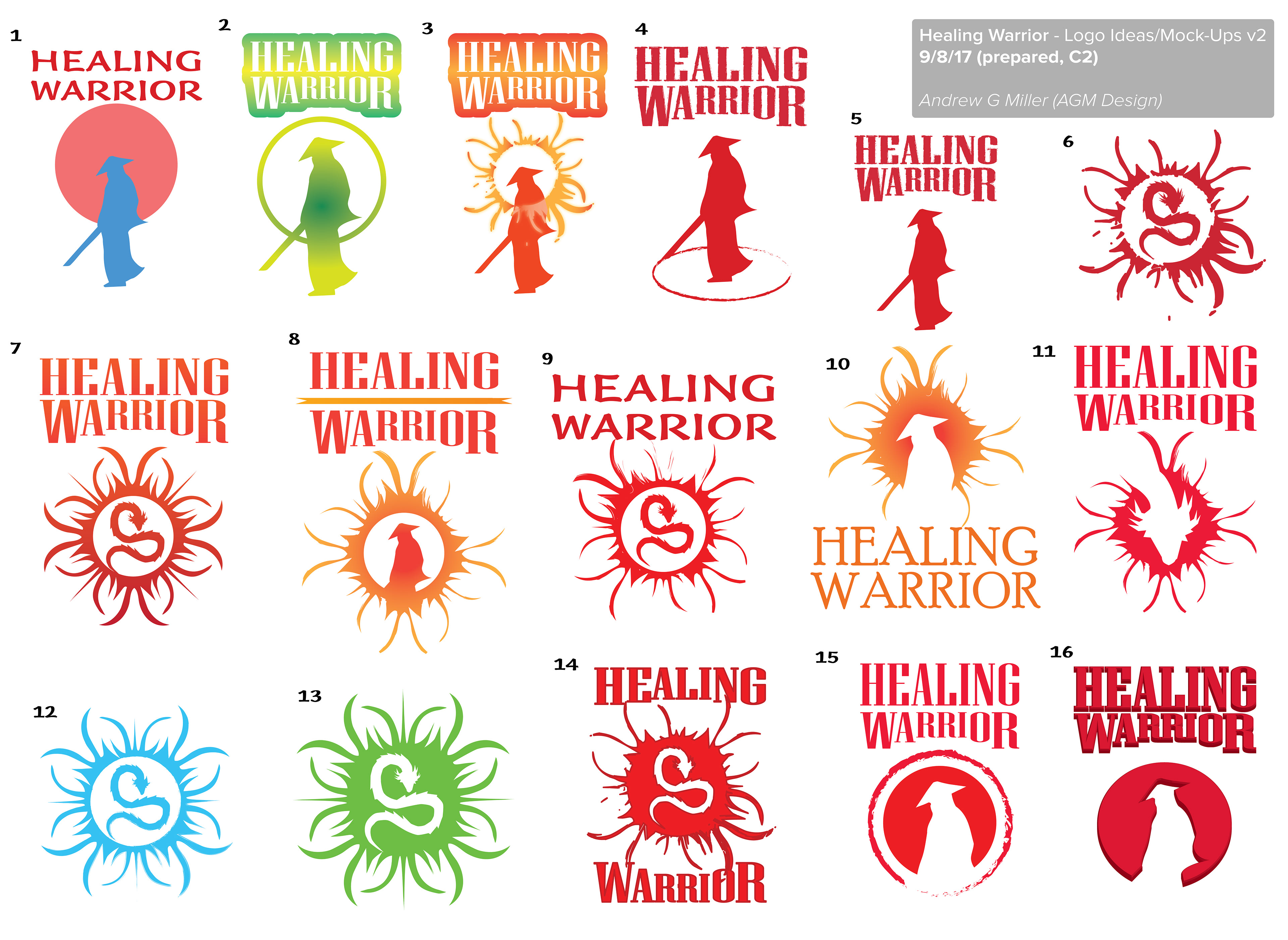
EARLY CONCEPTS AND RESEARCH
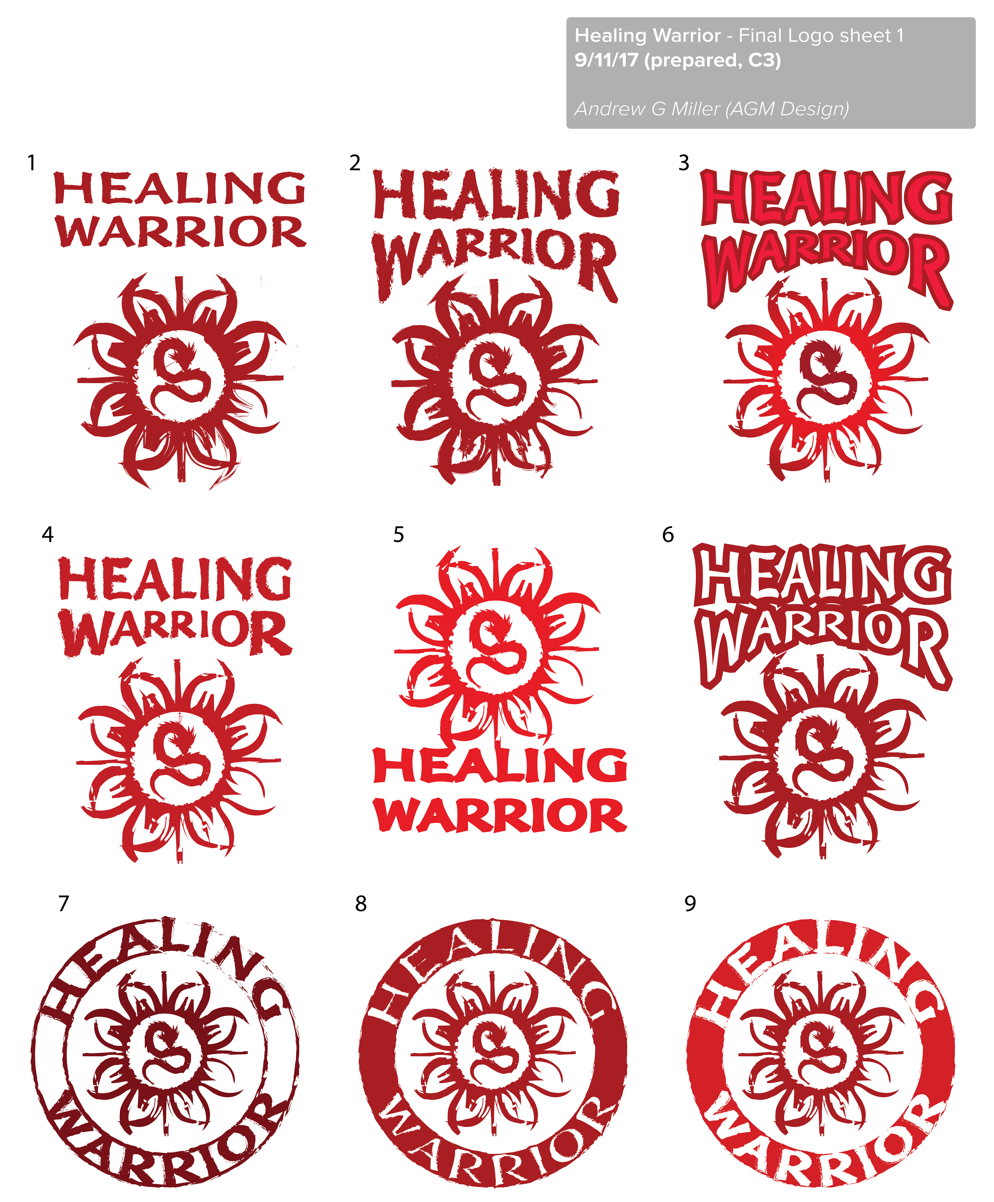
The Healing Warrior logo went through several style reruns and with the focus shifting away from the MMA and eastern feel for the most part. Initial designs included a samurai or ninja like figure in the sunset and several designs based on Japanese Kamikaze crossed swords emblems/patchs but they were too aggressive. The target audience is the gym/MMA/action sports crowd but it also needed to appeal to a general fitness crowd and mixed sex crowd as well.
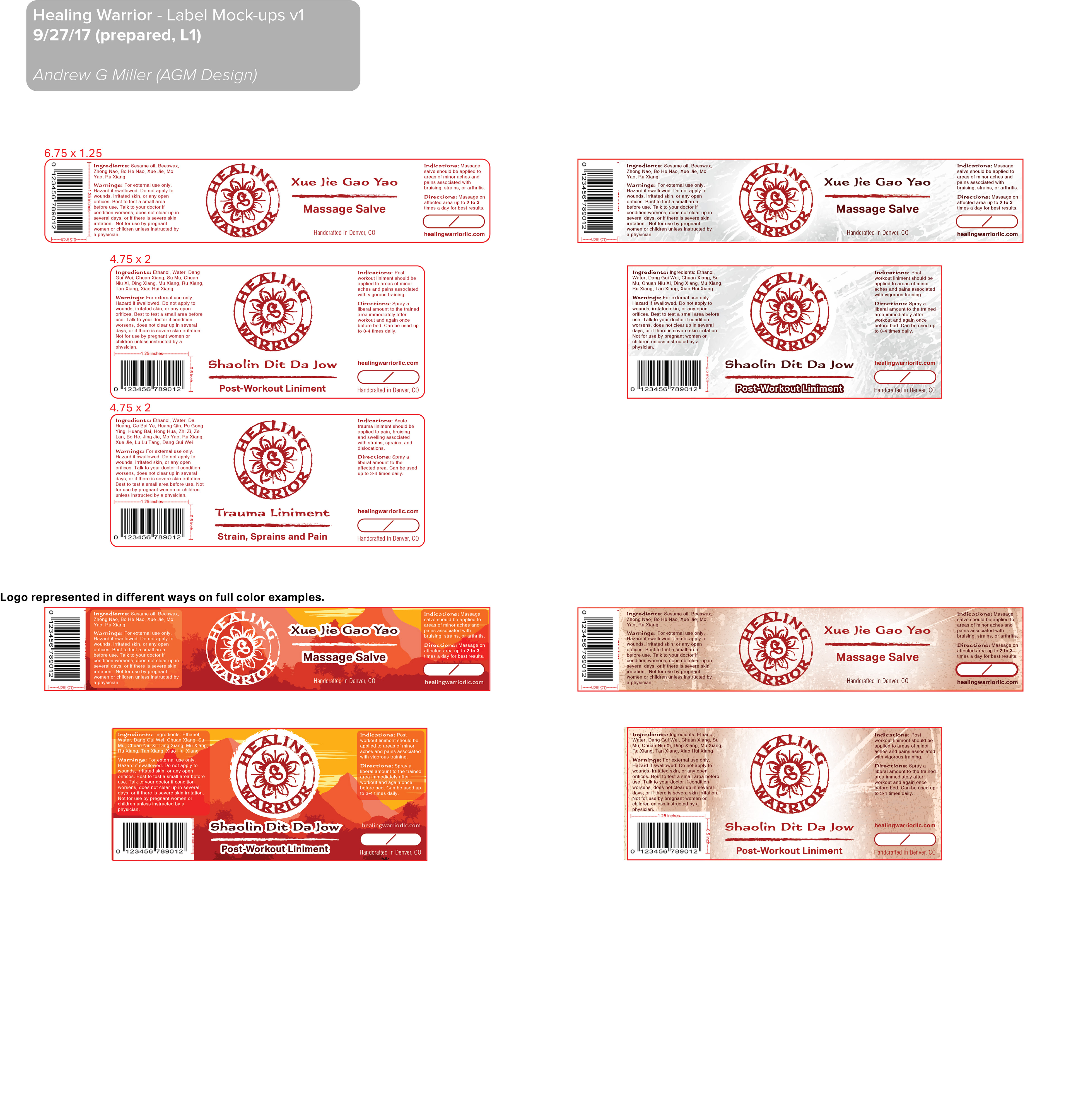
PRODUCT LABEL DESIGN
The design process for the bottle labels was fast as there was a fast approaching deadline. We worked through the examples shown below to produce the final result while sticking to the "eastern medicine" theme established in the logo creation process.
Printing was done through Sticker Mule's online print shop.